Interior design, a potent blend of art and functionality, transforms bare spaces into settings echoing with personal tales and feelings. This alchemy requires not just skill but a distinct source of inspiration. Among the pantheon of influences, Pantone reigns supreme, consistently leading the design community with its wide-ranging color palettes and avant-garde trend predictions. Let's embark on a journey to understand Pantone's immense influence in the realm of interior design, backed by compelling statistics that illuminate its widespread relevance.
Pantone's Global Footprint in Design
Pantone Connect's Rising Popularity: With an impressive roster of over 10 million users across the globe, Pantone Connect has cemented its position as an indispensable asset for the design fraternity. This platform, beyond its basic functionality, acts as a unifying space for designers to exchange ideas, thereby shaping the zeitgeist of design epochs.
A Universal Language for Designers: Pantone Connect's reach extends to professionals in over 120 nations, emphasizing its pivotal role in global design dialogues. This widespread adoption attests to the deep-seated need for a unified, consistent language of color, ensuring that a shade visualized in one corner of the globe mirrors what's implemented in another.
Dominance of the Pantone Color Matching System (PMS): A staggering 90% of professional designers swear by the Pantone Color Matching System (PMS). Such overwhelming reliance isn't just about the extensive range of colors but speaks to the system's unparalleled accuracy, guaranteeing that designers' visions are realized with absolute fidelity.
Pantone Color Institute's Trend Forecasting: The Pantone Color Institute goes beyond cataloging shades; it endeavors to foresee the future of color. Their expertise in predicting trends across varied industries, from haute couture to cozy home interiors and innovative product designs, sets the tone for the year ahead, allowing designers to be pioneers rather than followers.
Anticipation of the Color of the Year: The annual ritual of the 'Color of the Year' announcement by Pantone is no less than an Oscar ceremony in the design universe. This single shade often dictates the mood for industries, becoming the cornerstone for designs that resonate with contemporary sensibilities.
Decoding the Color Trends of 2023
Reflecting upon the past, 2023 emerged as a year of juxtapositions and balance in the world of interior design:
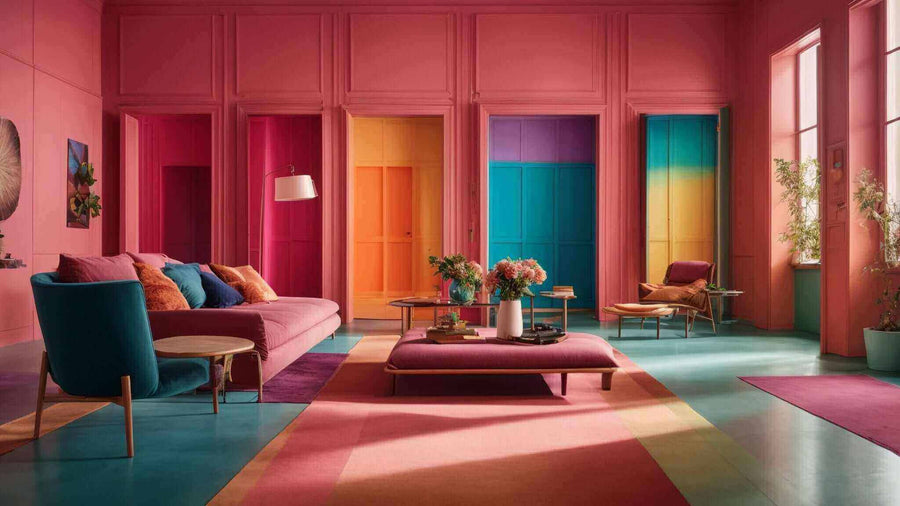
Gray and Yellow, A Dual Narrative: PMS 17-5104 Ultimate Gray, with its adaptable nature, served as an anchor in diverse settings, from modern minimalist lofts to classic Victorian houses. Its counterpart, PMS 17-5103 Illuminating, a zesty yellow, juxtaposed this neutrality, introducing a dash of hope and sunshine, particularly vital in a world recovering from global challenges.
Earth's Palette in Homes: PMS 11-0602 Terracotta and PMS 18-1339 Caramel were more than mere shades; they were Earth's essence distilled into interiors. These colors, redolent of sun-baked clay and golden sunsets, brought a tactile, grounding warmth, serving as antidotes to the digital saturation of contemporary life.
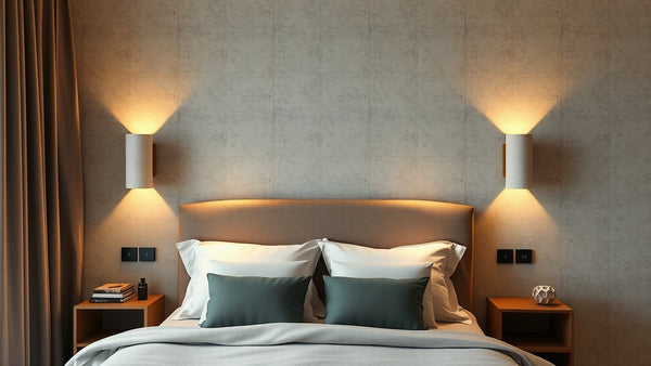
Blue, The Timeless Muse: PMS 19-3838 Classic Blue transcended its role as just a shade. As a favorite for accent walls and statement furniture pieces, it infused spaces with a depth reminiscent of serene evening skies and tranquil ocean depths.
The Sage Narrative: The subtle rise of PMS 17-5808 Sage was reflective of society's collective yearning for tranquility and peace. Its forecasted dominance in 2024 signals a continued move towards interiors that serve as havens, away from external chaos.
Glimpses into 2024: The New Color Protagonists
As the horizon of 2024 unfurls, new heroes emerge in the color landscape:
Verdigris, Nature's Whisper: PMS 18-5808 Verdigris isn't merely a green; it's the dense foliage of a rainforest, the patina on ancient statues, and the essence of nature cocooned into interiors. Its rising popularity hints at designs gravitating towards raw, organic aesthetics.
Lovebird's Ode to Joy: PMS 18-5815 Lovebird’s vivacious pink is the emblem of unbridled joy. A celebration of life, this shade is set to splash interiors with a vivacity reminiscent of blooming spring orchards.
Whisper, The Lullaby of Spaces: The gentle embrace of PMS 18-4134 Whisper blue promises to transform spaces into realms of solace. It's not just a color but a mood, encapsulating the soothing lull of a gentle brook or the first light of dawn.
Golden Days with Summer Song: PMS 18-4416 Summer Song isn't merely a yellow; it's nostalgia and warmth bottled up. This hue, with its golden undertones, promises to envelope rooms in a sunny embrace, evoking memories of lazy summer afternoons.
Peach Parfait's Ballet: PMS 18-5309 Peach Parfait pirouettes gracefully between strength and softness. With its delicate presence, it hints at a resurgence of pastel palettes, ensuring interiors radiate with a soft, ethereal glow.
The marriage between interior design and Pantone is a harmonious one, a blend of science, art, and intuition. For designers aiming to craft spaces that are not just visually stunning but emotionally resonant, Pantone remains the North Star, guiding the way with its color stories and trend forecasts. As we paint the canvas of our interiors, Pantone's shades ensure that the narratives we craft are not only beautiful but deeply meaningful.
Nauradika Trade