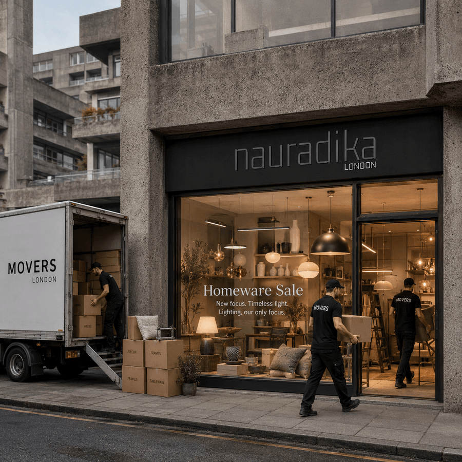
When Nauradika launched, we were passionate about beautiful homes in all their forms. Our catalogue ranged widely — from decorative objects and kitchen accessories to soft furnishings and, yes, lighting. We were a homeware store with ambitions, and for a while, that felt like the right approach.
But something kept pulling us back. Time and again, the products that resonated most with our customers — architects specifying a hotel lobby, interior designers sourcing fixtures for a residential project, homeowners transforming a dark hallway — were our lights. Not the cutting boards. Not the blankets. The lights.
The Moment We Decided to Specialise
The decision wasn't made in a boardroom. It came from listening — to our customers, to our data, and honestly, to ourselves. We kept finding that the conversations we were most excited to have were about lighting: the difference a well-positioned floor lamp makes to a room, the way a brushed brass sconce catches evening light, the technical nuances of colour temperature and CRI that matter to professionals but that most retailers gloss over.
"We realised we were a lighting company that also happened to sell other things. So we stopped selling other things."
That clarity was liberating. We made the decision to focus exclusively on lighting — and to do it properly.
Building a Team That Actually Knows Lighting
Specialisation meant more than editing our product catalogue. It meant building expertise we could stand behind. We brought in specialists: people with backgrounds in architectural lighting design, electrical engineering, and hospitality interiors. Our team now includes professionals who have specified lighting for hotels across Europe, worked alongside leading interior designers, and understand the practical realities of installation, IP ratings, and wiring regulations in both the UK and French markets.
This isn't a team that sells lighting. It's a team that understands it — the physics of how light behaves in a space, the psychology of how it affects mood and perception, and the commercial reality of what trade prices should actually look like.
What Specialisation Looks Like in Practice
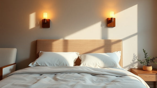
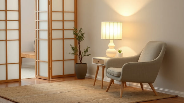
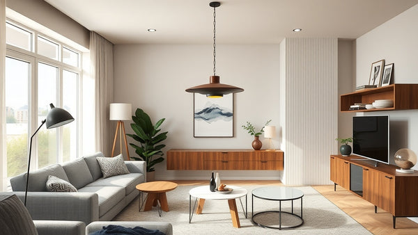
Curated catalogue. We don't list 50,000 products. We list the lights we would specify ourselves — wall lights, pendants, floor lamps, and ceiling fixtures that meet our standards for design integrity, build quality, and value. Every product in our catalogue has been reviewed by someone who understands what makes a lighting fixture worth installing.
Trade pricing. Architects, interior designers, and hospitality buyers shouldn't pay retail prices. Our pricing model reflects that. We work with CSS (Comparison Shopping Services) to ensure our prices are competitive — and our data consistently shows we are cheaper than comparable retailers 75% of the time.
Market focus. We serve the UK and French markets with dedicated local expertise. We understand planning considerations, wiring standards, and the aesthetic preferences that differ between a London townhouse and a Parisian apartment.
What Happened to Our Homeware Content
Over the years, our blog covered a wide range of topics — interior design history, colour theory, material trends, and yes, some content that had nothing to do with lighting at all. As part of our refocus, we have retired content that no longer reflects who we are. You may notice some articles that previously appeared on this blog are no longer available.
What remains — and what we are continuing to build — is a body of knowledge about lighting specifically: how to choose the right fixture for a space, how lighting interacts with architecture and materials, the history of design movements that shaped the fixtures we love today, and practical guidance for professionals specifying lighting at scale.
Why This Matters for Our Customers
When you buy a light from a generalist homeware retailer, you are one SKU among thousands. When you buy from Nauradika, you are buying from people whose entire professional focus is lighting. We notice when a product has a quality issue. We track how designs perform in real hospitality environments. We know which wall lights have the best approval rates for period properties and which pendants are most specified by Scandinavian-influenced designers.
That depth of knowledge is what specialisation buys you — and it is what we are committed to delivering.
Looking Forward
Nauradika today is leaner, more focused, and more confident than ever. Our catalogue continues to grow — but deliberately, with every addition meeting our curatorial standards. Our content is being rebuilt around genuine expertise in lighting design, architecture, and interiors. And our team is expanding with people who share the same obsession with getting light right.
If you are an architect, interior designer, hotel developer, or homeowner who takes lighting seriously — we built this for you.
Explore our full lighting catalogue at nauradika.com, or get in touch with our team for trade pricing and project support.
Featured in this guide
View collectionWhy this style works
Frequently asked questions
Nauradika Trade