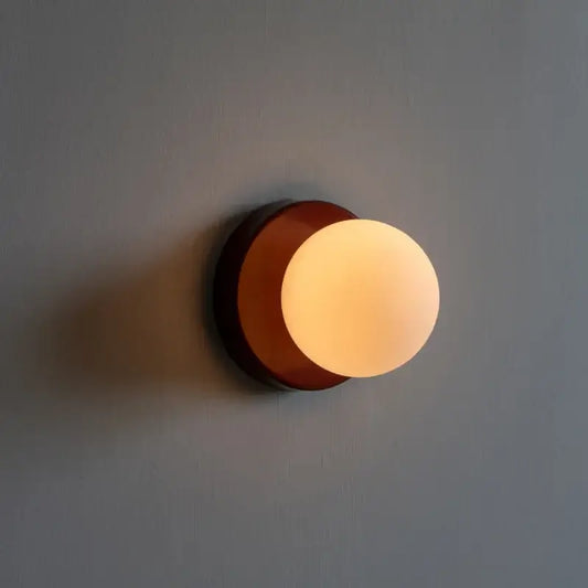
Use accent colors sparingly in interior design
|
|
Time to read 2 min

Discover new arrivals in modern lighting, home decor, and Scandinavian design—updated weekly...
|
|
Time to read 2 min
Color is a powerful tool in interior design, capable of setting the mood, creating visual interest, and influencing our emotions. When it comes to incorporating color into a space, using accent colors sparingly can be a smart approach. By carefully selecting and strategically placing accent colors, you can create a cohesive and visually appealing environment without overwhelming the senses. In this article, we will explore the art of using accent colors sparingly, following the BAB (Before, After, Bridge) method to help you understand how to incorporate accent colors effectively and achieve a harmonious design.
Opportunities Before diving into the world of accent colors, it's important to understand the space and identify opportunities where accent colors can be incorporated. Consider the following factors:
Existing color palette: Evaluate the existing color palette of the room. Look for dominant colors and neutrals that can serve as a foundation for your accent colors. Understanding the base color scheme will help you choose complementary accent colors.
Architectural features: Assess the architectural features of the space, such as walls, trim, and built-in elements. These areas often provide natural opportunities to introduce accent colors and create focal points.
Purpose and mood: Consider the purpose of the space and the mood you want to achieve. Different accent colors can evoke different emotions, so choose colors that align with the desired atmosphere.
Once you have assessed the space and identified opportunities, it's time to incorporate accent colors sparingly. Follow these steps to create a cohesive and visually appealing space:
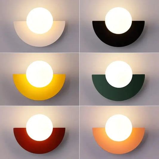
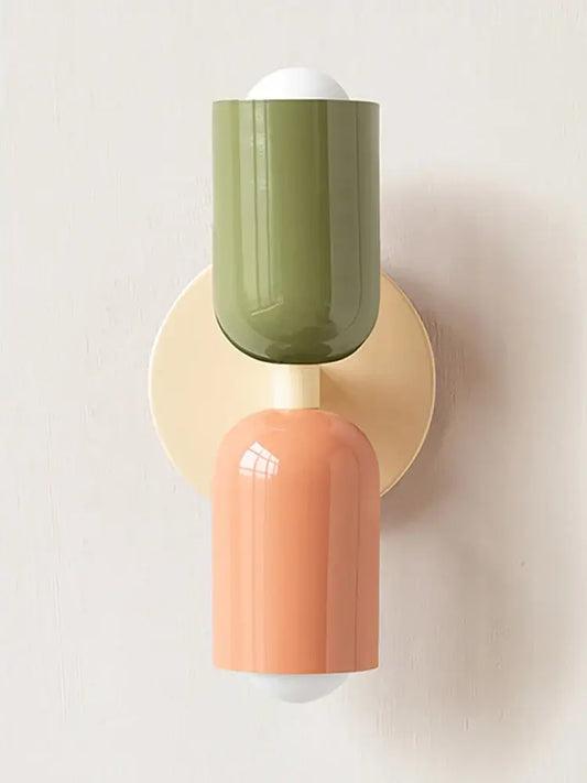
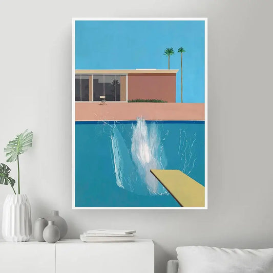
Choose a focal point: Select a focal point in the room where you want to draw attention. This could be a piece of furniture, artwork, or architectural detail. Use an accent color to highlight and enhance that focal point, creating a visual anchor in the space.
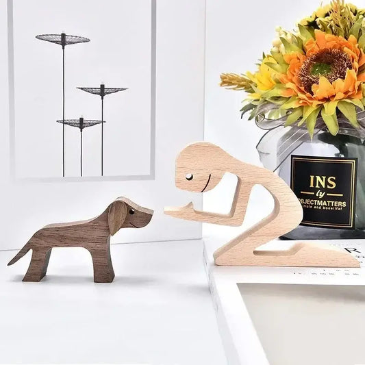
Accessorize with intention: Introduce accent colors through carefully selected accessories such as throw pillows, rugs, curtains, or decorative objects. These small touches of color can add visual interest and create a cohesive color scheme without overpowering the room.
Create color harmony: Ensure that the accent colors you choose harmonize with the existing color palette. Consider complementary colors or shades from the same color family to create a cohesive and visually pleasing composition. Avoid using too many different accent colors, as it can lead to a chaotic and disjointed appearance.
To achieve cohesion and visual appeal with accent colors, consider the following tips:
Balance and proportion: Use accent colors in a balanced and proportional manner. Distribute them strategically throughout the space to create a harmonious flow and prevent one color from dominating.
Negative space: Allow for negative space in the design, where the eye can rest and appreciate the overall composition. Too many accent colors can overwhelm the senses, so be mindful of creating balance between colored and neutral areas.
Consider the function: Take into account the function of the space and the intended mood. Calming accent colors may be suitable for bedrooms or living areas, while vibrant accents can work well in energetic spaces like playrooms or home offices.
Using accent colors sparingly is an effective approach to creating a cohesive and visually appealing space. By understanding the space, identifying opportunities, and incorporating accent colors strategically, you can achieve a harmonious design that highlights key elements and evokes the desired atmosphere. Choose a focal point, accessorize with intention, and create color harmony to make the accent colors truly shine. Remember to maintain balance and proportion, allowing for negative space, and consider the function of the space. With these considerations in mind, you can confidently incorporate accent colors sparingly, resulting in a visually stunning and well-designed interior.
You will find many other interior design tips in our Top 50 Best Kept Secrets Used By Interior Designers to Transform your Space.
Like our Magazine? You will like our store even more with all its curated homeware, modern lighting, kitchen utensils and Wall Art. We also recommend that you sign up to our newsletter or follow us on social media to find out about our news article releases, promotions and discount codes.