Interior Design Course | Colour: A Journey Through Trends, Terminology, and Harmonious Schemes
|
|
Time to read 2 min

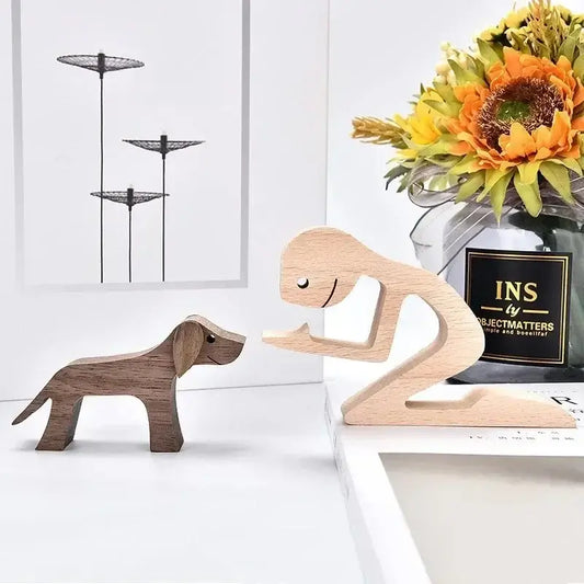
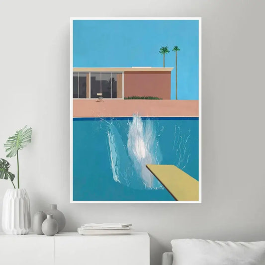
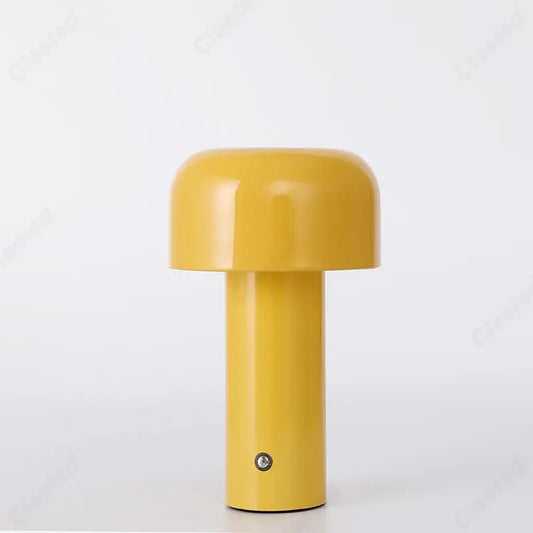
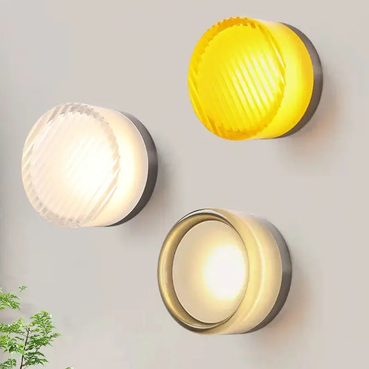
Discover new arrivals in modern lighting, home decor, and Scandinavian design—updated weekly...
|
|
Time to read 2 min
Introduction
Colour plays a vital role in interior design, setting the mood, defining the ambiance, and evoking emotions within a space. Interior designers must stay attuned to ever-changing fashion and colour trends to create captivating and relevant environments. This article delves into the impact of colour trends in interior design, explores colour terminology and basics, investigates warm vs. cool colours and their psychological effects, and guides readers on creating harmonious colour schemes while using colour to manipulate space.
Colour trends, influenced by fashion, art, culture, and global events, have a profound impact on interior design choices. Staying updated on emerging trends is crucial for interior designers to create spaces that resonate with clients and occupants. Colour forecasting organizations like Pantone and Color Marketing Group provide insights into upcoming colour palettes that shape design choices.
References:
Understanding colour terminology is essential for designers to communicate effectively. The colour wheel, comprising primary, secondary, and tertiary colours, serves as the foundation for colour combinations. Complementary, analogous, triadic, and monochromatic colour schemes offer different aesthetic effects.
References:
Warm colours, like red, orange, and yellow, evoke energy, passion, and coziness. They are ideal for creating inviting spaces but may be overwhelming when used excessively. Cool colours, such as blue, green, and purple, convey tranquility, calmness, and spaciousness. Cool colours are often used to enhance relaxation and contemplation.
References:
Creating harmonious colour schemes involves the skillful use of colour combinations to achieve a balanced and visually appealing result. Understanding colour psychology is crucial for selecting colours that complement each other and create a cohesive atmosphere.
References:
Colour can be a powerful tool in manipulating the perception of space. Light colours tend to expand space, making small rooms feel more open, while dark colours create a sense of intimacy and coziness in larger areas. Accent walls and focal points can be strategically painted to emphasize architectural features.
References:
Conclusion
Colour is a multifaceted tool in interior design, capable of transforming spaces and evoking emotions. By understanding fashion and colour trends, mastering colour terminology and basics, exploring warm vs. cool colours, creating harmonious colour schemes, and using colour to manipulate space, interior designers can elevate their designs to new levels of beauty and functionality. Drawing inspiration from the work of designers, authors, and museums, along with staying updated on the latest colour trends, will enable interior designers to create captivating and timeless environments that truly resonate with occupants and stand the test of time.
Like our Magazine? You will like our store even more with all its curated homeware, modern lighting, kitchen utensils and Wall Art. We also recommend that you sign up to our newsletter or follow us on social media to find out about our news article releases, promotions and discount codes.